Project 04
Moovie – Cinema ticket booking made seamless and cinematic
Completion Date April 2025
Project Type: Personal UX/UI Concept
Tools: Figma, Mockuuups Studio
Duration: 4 weeks
Overview
Moovie is a concept mobile application that reimagines the way we book cinema tickets — turning a traditionally functional process into a visually engaging, cinematic experience.
From discovering upcoming releases to selecting the perfect seat, Moovie combines modern UX patterns with an emotional layer: the excitement of movie night
Τhe Problem
Most cinema apps focus heavily on logistics — listings, times, seats — but often feel generic, outdated, or even frustrating.
They miss the anticipation, emotion, and excitement that moviegoers associate with their night out.
There’s often:
UI clutter
Cold or transactional copy
Frustrating seat selection flows
A lack of clear, guided interaction
My challenge was to close the gap between task and experience:
Can booking a ticket feel like the beginning of the movie?

The Goal
Deliver a bold, branded first impression
Let users explore and filter movies with ease
Offer clear, quick paths to booking (date → cinema → seat)
Make seat selection enjoyable and readable
Provide a satisfying, visual confirmation moment
Use copy and color to support a cinematic mood
Key Features
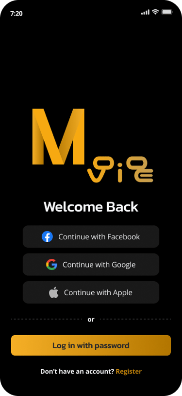
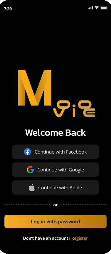
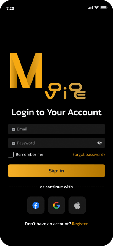
Calm & Cinematic Onboarding
The splash screen and login flow use high-contrast visuals and bold type, setting a strong, confident tone.
From the beginning, the user is invited into a focused, distraction-free space.
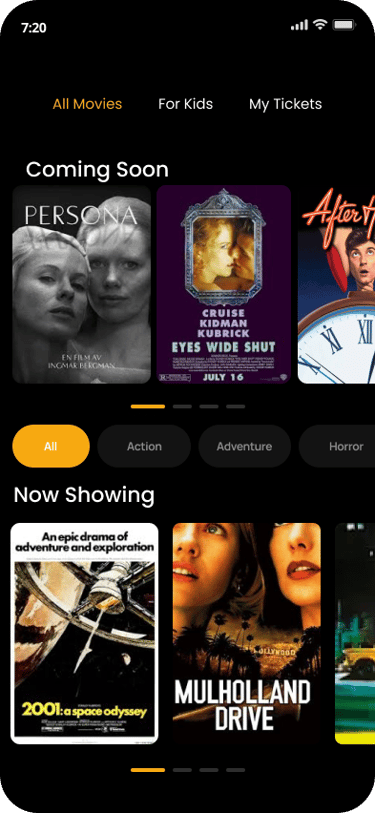
Movie Discovery
With horizontal scroll sections, filters (genre, upcoming, now playing), and big posters, users can explore easily — like browsing a digital movie wall.
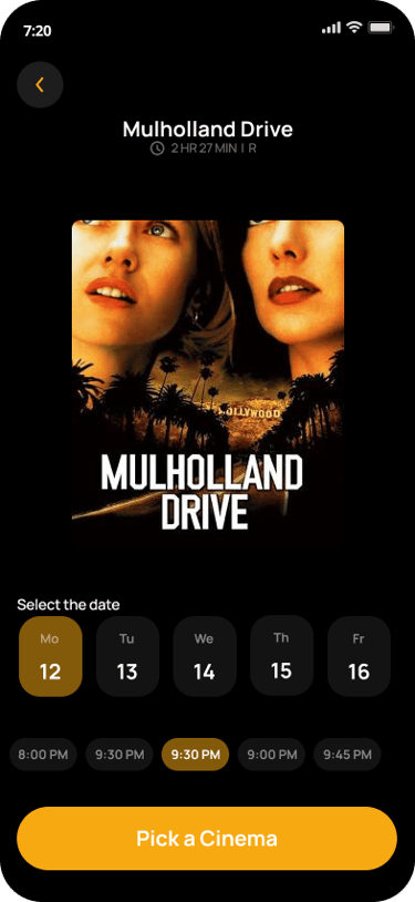
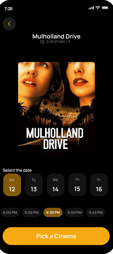
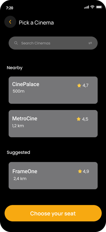
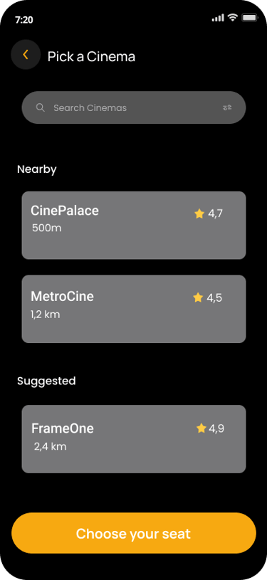
Showtimes & Location
A simplified calendar view and clean “pick a cinema” layout allows fast, low-friction decision-making.
Nearby cinemas include distance & ratings for context.
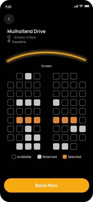
Interactive Seat Selection
A curved screen layout and color-coded seats make orientation intuitive.
Reserved/available/selected seats are clear, and finger-friendly.
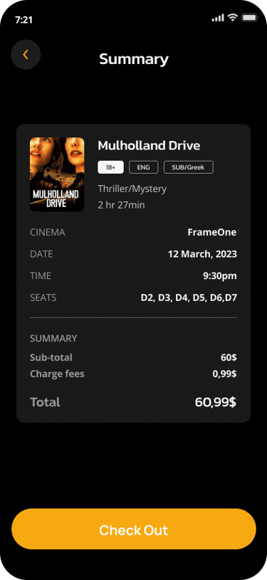
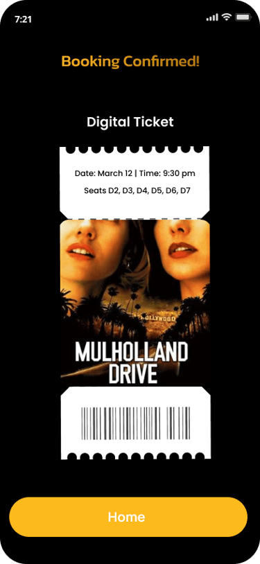
Digital Ticket & Confirmation
Post-checkout, a clean summary and stylized digital ticket gives users a final “yes” moment. It’s not just practical — it’s part of the experience

Visual Design
Color Palette:
#000000 for deep cinematic background
#FDBA1D for highlights (CTAs, seat selection, focus states)
#FFFFFF for text contrast
Typography:
Rounded sans-serif (clean, soft, and modern)
Titles are bold and wide, emphasizing structure
Design Style:
Dark theme
Poster-like movie tiles
Soft shadows, padding, and centered hierarchy


Outcome
The final design delivers an end-to-end booking flow that is:
Easy to understand
Visually memorable
Emotionally connected to the user’s real goal:
“Going to the movies.”
This case study showcases my ability to:
Create structure and logic in user flows
Balance brand with usability
Push visual identity while staying accessible
Reflection
Working on Moovie helped me explore what happens when branding meets interaction.
I challenged myself to:
Reduce each step to its essential function
Maintain emotional engagement throughout
Respect accessibility principles, especially contrast and spacing
If I were to evolve the product, I’d consider:
Loyalty system with rewards
Voice-activated movie search
Motion design & seat animation
Optional light theme